One of my favorite things is to check out the Colour of the Year reveals! The new colours for 2020 are spectacular! From Sherwin Williams, Behr and Pantone you are sure to be inspired!
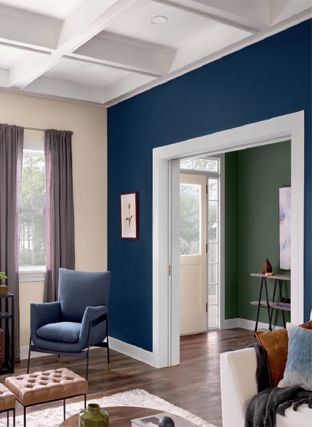
Sherwin Williams 2020 ColorMix Forecast is collection of rich hues that are sure to suit any taste from deep colours as seen with Naval “Colour of the Year” (SW6244 253-C6) and Ripe Olive (SW6209 217-C7) to soft inviting colours like Breathless (SW6022 191-C1) and Individual White (SW6008 231-C1).
You can download their full guide here. Each ColorMix Forecast, Haven, Mantra, Alive, Play and Heart, embrace feelings from nature and everyday elements that connect us to our surroundings and the people we share them with. As humans we have an internal need to connect with our surroundings, to feel comfort and security. Sherwin Williams has created an awe inspiring palette that will add depth to a room, create a focal point for a piece of furniture or create a custom kitchen using the colour of your inspiration while feeling that connection to our natural surroundings of nature. Navel represents the night sky where Ripe Olive connects us to plants and trees.
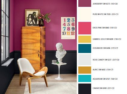
Have you ever walked into a room and felt like you never want to leave? Colour, lighting and design play a huge role in these feelings of connection to a space. I have begun to be more consciously aware of the elements in a space that enhance these feelings or inversely make us want to leave a space as soon as we enter. As individuals we choose colours primarily based on psychological traits (which we will get into in a future blog post) but for now follow your instinct or the colour that catches your attention first.
Behr (available at Home Depot) is one of my favorite brands of paint to work with for a few reasons: coverage, ability to accept deep tints without affecting the coverage, and VOC’s. If you have done a lot of painting you develop a personal preference based on your experience, all my experiences with Behr have been great! That said their Colour Trends 2020 will not disappoint! Back To Nature (S340-4) is the Behr colour of the year pick.
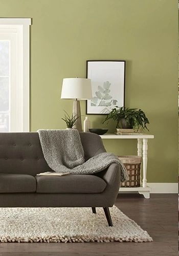
The colour palettes introduced for 2020 have a theme or feeling of reconnection or getting back to basics (or nature) as the name says it all. The awareness of our environment and effects of pollution are everywhere in the news. Many manufacturers are implementing sustainable or more environmentally responsible practices and I believe this has a global influence on many consumer based choices.
Take a look at Pantones colour of the Year choice: Bleached Coral. Bleached coral signifies what happens after a coral reef dies. Whether its an environmental change or a man-made cause there are undeniable changes that are occuring around the globe. These issues are making their way into the world of design. Bleached Coral is a calming hue that connects our space to nature.
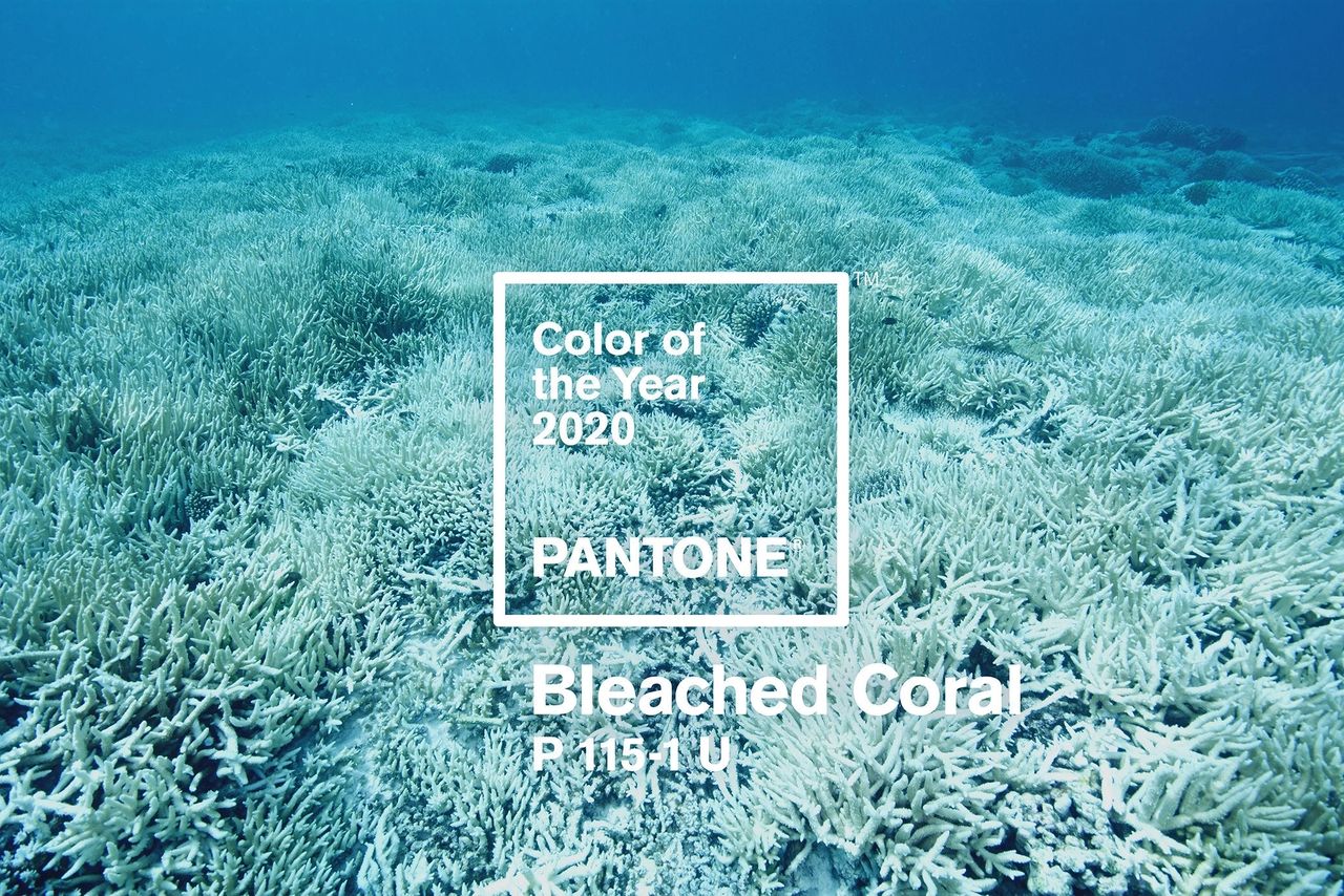
The connection to what is familiar seems to be an overwhelming trend in this years picks. Creating spaces of calm and serenity is always a great choice when choosing colours for your home.
When you get around to that endless To-Do list and it comes time to select the perfect colour for your bedroom, kitchen or bathroom there will be plenty of new choices with the 2020 Colour of the Year options.
Tip #1: When looking for inspiration take a piece of artwork, fabric or something that brings you joy to base your colour palette. Each room does not have to be the same colour but open spaces should blend together.
Tip #2: Decide if you are going with a complimentary, contrasting or shades of one colour (monochromatic) colour scheme. Accent walls can be a shade or two deeper than the primary walls or a different colour all together.
Tip #3: Clearer hues are crisper, brighter and often more vibrant. If you are unsure about a choice most paint stores have tester size options that you can have tinted to try a small area in your home (where lighting and reflection is more accurate).
Tip #4: When painting trim sometimes plain white can feel harsh. I like to use the lightest colour on a paint chip (or tinted at 50%) for trim and doors.
Tip #5: Paint durability has come a long way in recent years and it is no longer necessary to use higher gloss for scrubability! The lower the sheen the more a paint hides minor imperfections. My personal choice is eggshell or similar (based on brand) and a satin for trim. Flat still isn’t as washable and reserve this for ceilings or areas where traffic is low.
Happy painting!
